I admit I haven't kept up well with Work of Art on Bravo, so I was excited when episodes were replaying this afternoon. I had wanted to see episode 3 where the artists' challenge is to design a book cover for a classic: Frankenstein, Dracula, Pride and Prejudice, The Time Machine, Alice in Wonderland and the Strange Case of Dr. Jekyll and Mr. Hyde. The winner would have his/her cover used as a Penguin Classic cover.
I'm completely guilty of judging books by their covers. Can you blame me? Who doesn't love beautiful design or images? But, thanks to my magazine design course last semester, now "content-driven design" is also forever burned into my brain.
So while I watched this episode I got really worked up by the works that had nothing to do with the corresponding book's content.
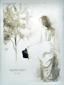
Pride and Prejudice cover by Jaclyn
For example, this does not tell me anything about Pride and Prejudice. Half-naked woman with a top hat ... no, I don't get it. Oh, and although you can't see it, she misspelled Jane Austen (Austin). No, no, no.
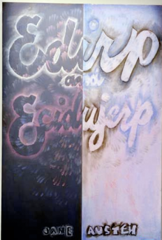
Pride and Prejudice cover by Judith
Judith, on the other hand, decided flipping the name of the book was a good idea. Oh, and her finger prints are supposed to resemble a flower because, apparently, all Pride and Prejudice is about is flowers, gardens and romance. Humph.
Maybe because Pride and Prejudice is one of my favorite books (and because I admittedly haven't read any of the other books) , I didn't like either of these pieces. More so, I felt like neither of them gave the book's content any consideration. Judith complained that she is a fine artist, not someone who designs book covers. OK, but couldn't you at least try to tell a story with your work? I'm sure that's nothing new for any artist.
Maybe because Pride and Prejudice is one of my favorite books (and because I admittedly haven't read any of the other books) , I didn't like either of these pieces. More so, I felt like neither of them gave the book's content any consideration. Judith complained that she is a fine artist, not someone who designs book covers. OK, but couldn't you at least try to tell a story with your work? I'm sure that's nothing new for any artist.
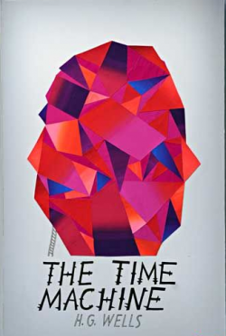
This was the winning cover by John. I've never read The Time Machine, but this cover kind of makes me want to. It's graphically interesting and, if nothing else, grabs the viewer's eye simply with its bright colors. I wish I could say whether I think it's content-driven design, but the judges sure thought so.
This challenge brought up the age-old discussion of low art and high art. Andy Warhol blurred the line between the two when Campbell soup cans became a work of art. He made screen printing an art medium and not something just used by advertisements.
I care less about whether something is "low" or "high" art than whether it's interesting. I'm a sucker for great design and interesting images. That's why on my bedroom wall you'll find something like this:
I care less about whether something is "low" or "high" art than whether it's interesting. I'm a sucker for great design and interesting images. That's why on my bedroom wall you'll find something like this:
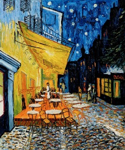
My favorite van Gogh: Cafe Terrace at Night
Next to this:
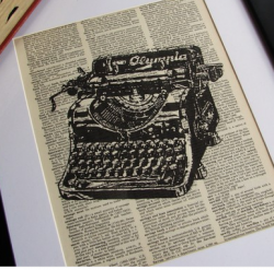
A print by littlebluebirdstudios on etsy.
Each speaks to me and about me in different ways.

 RSS Feed
